
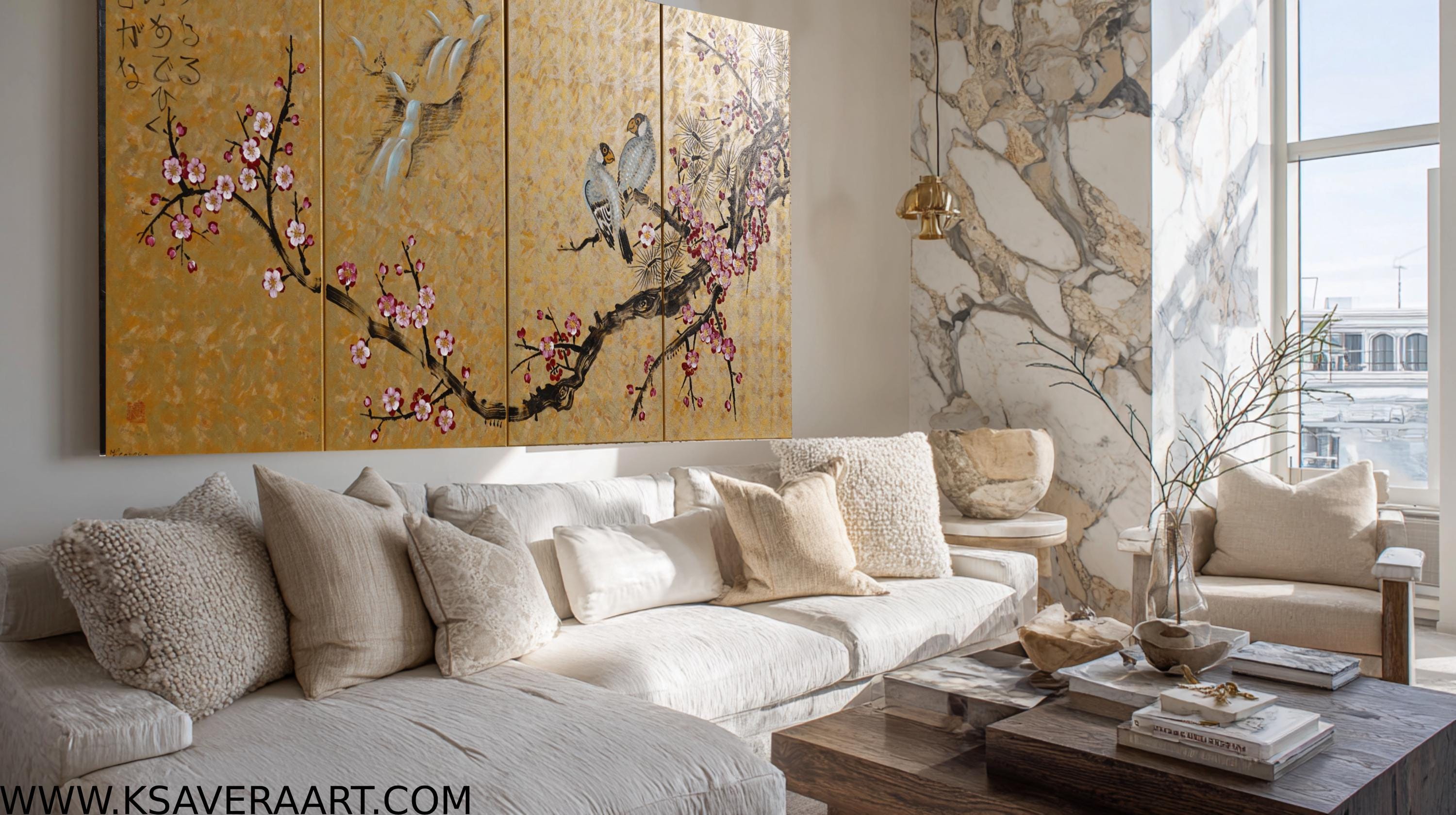
A large painting should not politely disappear into the background. It should alter the atmosphere of a room from the moment you enter it.
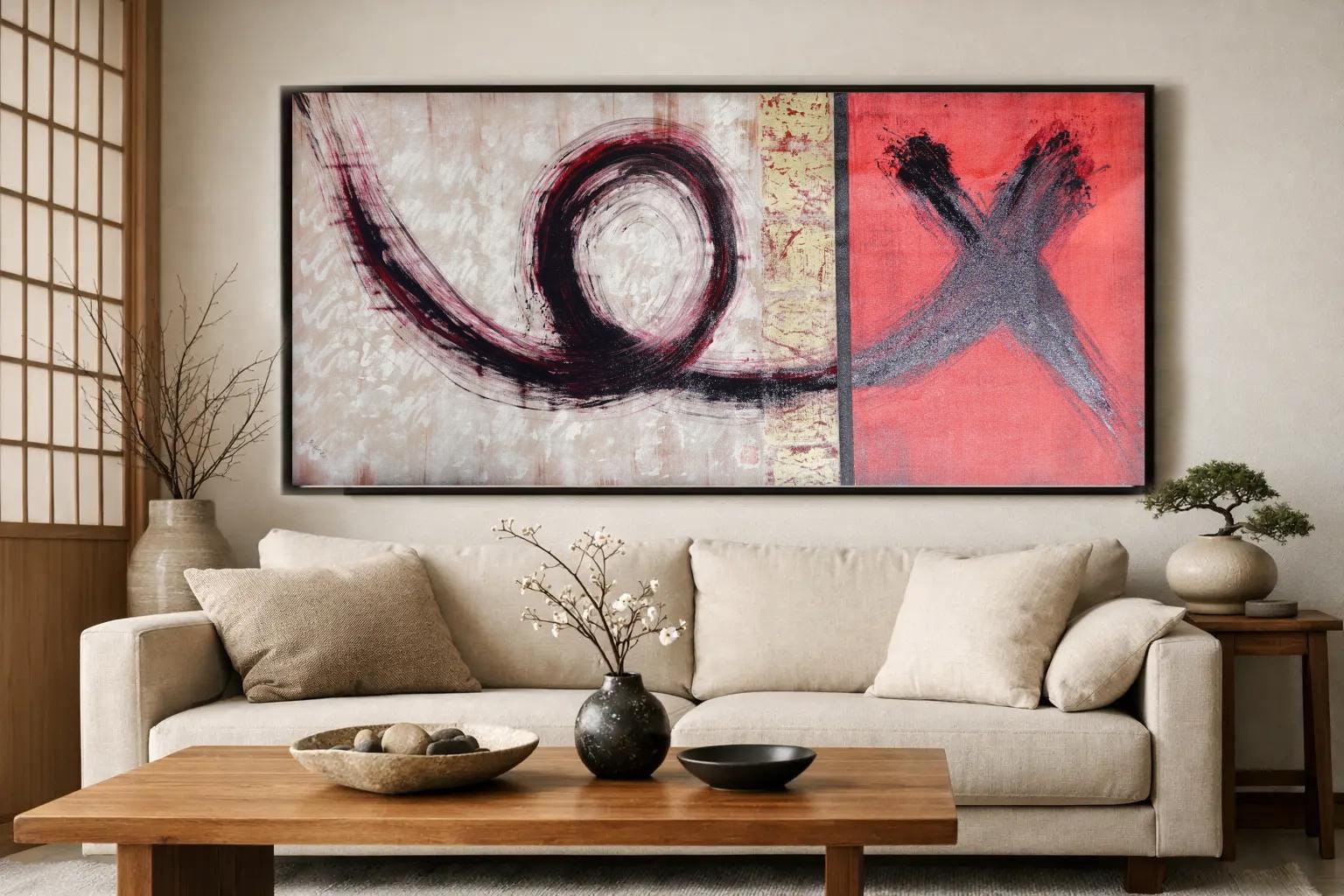
A wall can be beautifully furnished and still feel unfinished. Often, the missing element is not another lamp, cushion or decorative object, but a painting with enough presence to hold the room together. The right xxl art does more than occupy empty space: it establishes proportion, introduces atmosphere and gives an interior a clear visual centre. Large-scale art asks for a more considered choice than a small framed print. Scale amplifies every decision - colour, texture, composition and placement all become part of the architecture of the room. Chosen well, one substantial original can make a calm contemporary space feel collected rather than merely decorated.
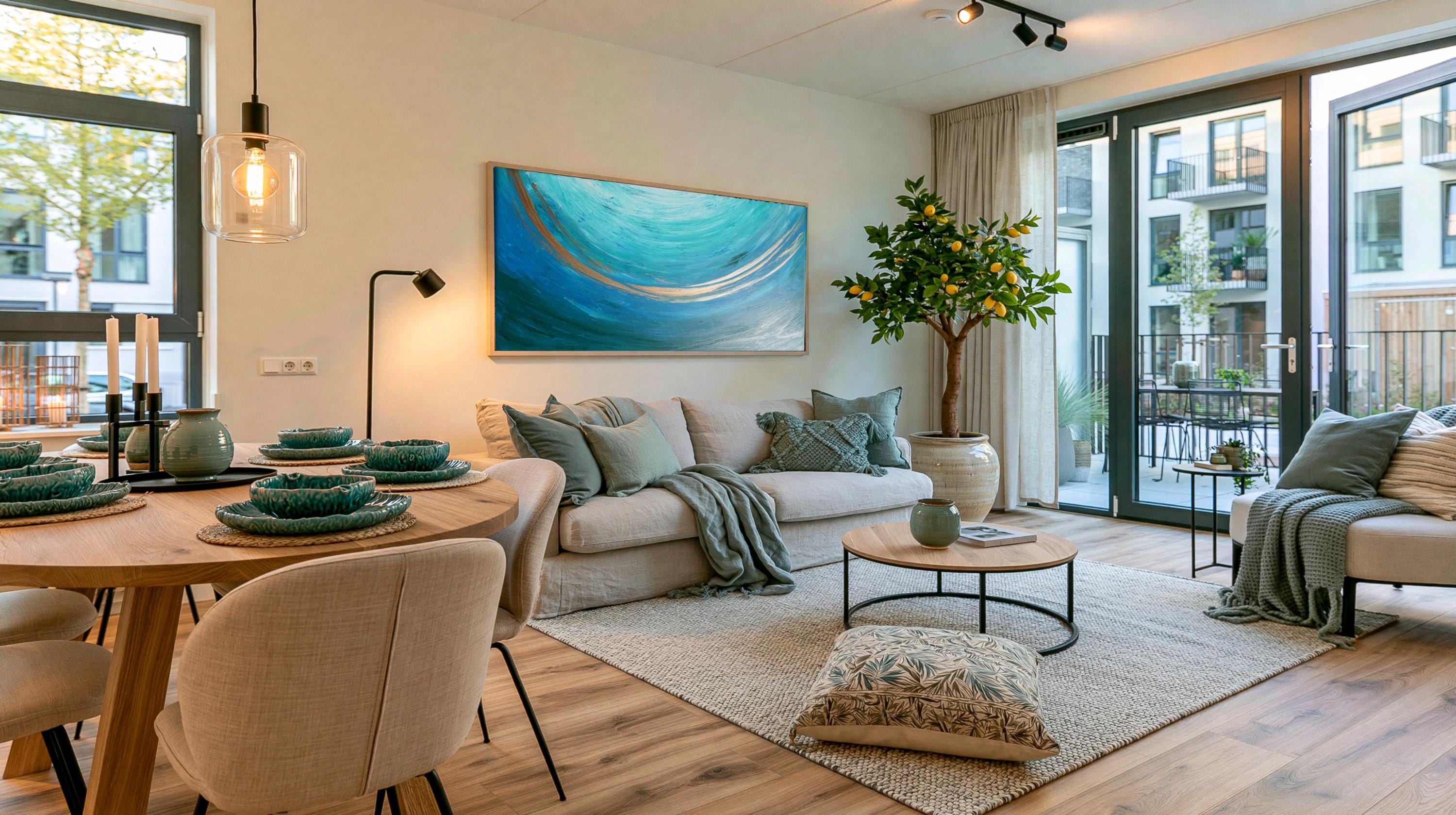
Why XXL art changes the character of a room
A large painting is read from across the room before its details are noticed. This immediate impact is precisely why it can transform an interior so quickly. Above a sofa, dining table, sideboard or bed, it creates a focal point that gives furniture a sense of purpose and visual weight. There is also an emotional difference between art that fills a corner and art that commands a wall. A generously sized abstract composition can make a pared-back room feel warmer and more expressive.
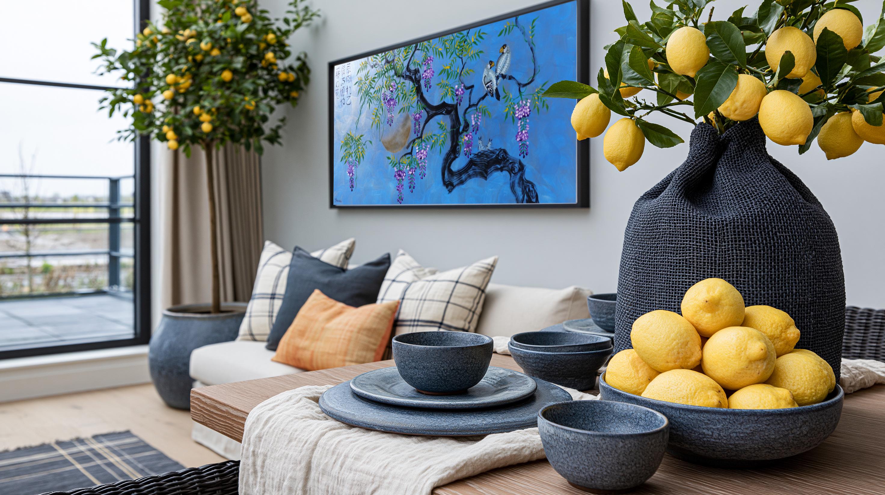
A Japanese-inspired painting with cranes, sakura or a quiet seasonal landscape can introduce stillness without making the space feel formal. The scale makes the artwork an experience rather than an accessory. This does not mean every wall needs the largest possible canvas. An oversized work in a narrow or heavily furnished room can feel crowded, particularly where there are competing patterns, open shelving or dramatic lighting. XXL art works best when it has room to breathe. Negative space around the painting is not wasted wall space - it is what allows the composition to be seen properly.
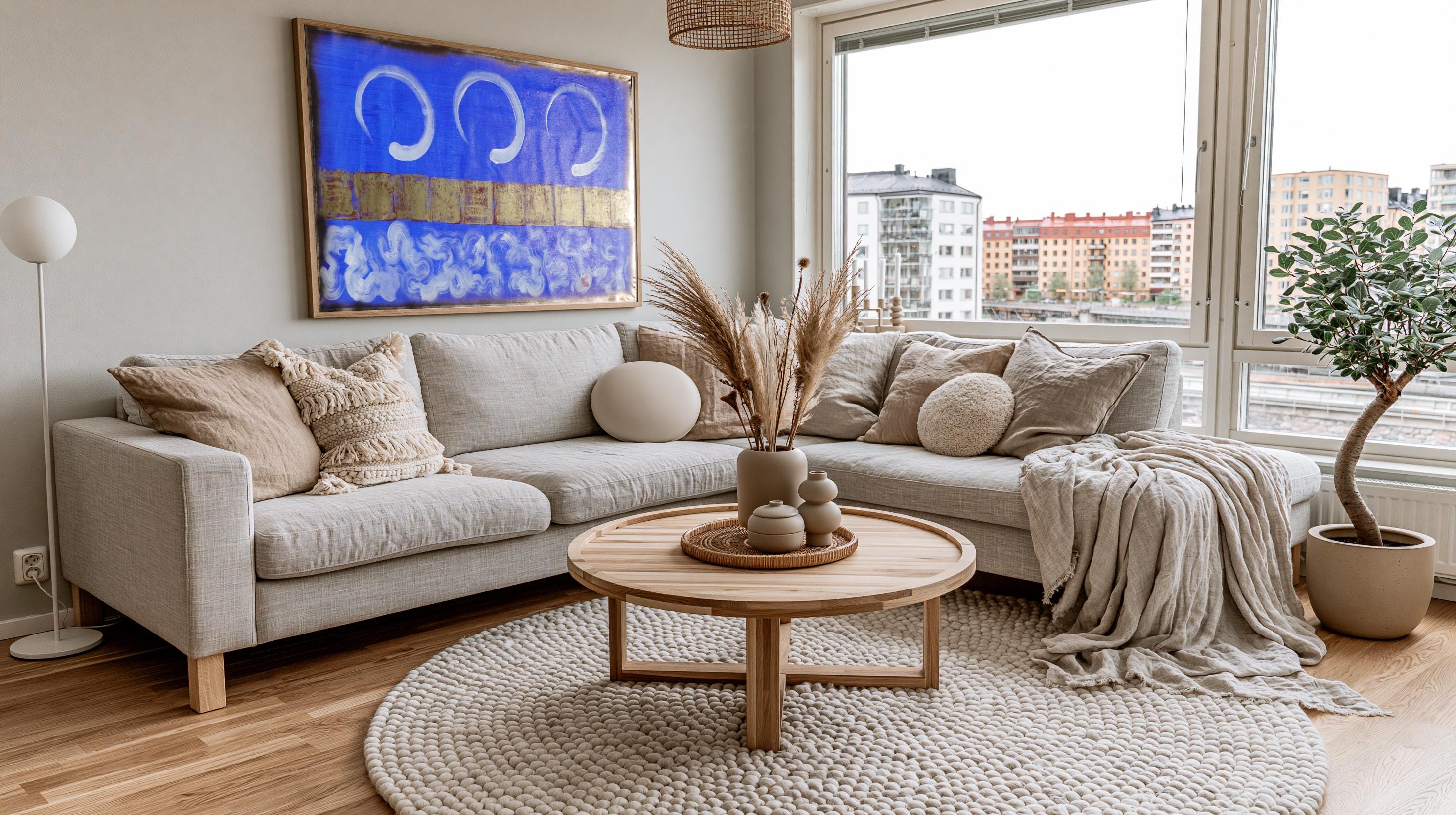
Start with the wall, not the canvas size
The most reliable way to choose large wall art is to measure the wall and the furniture beneath it before falling for a specific image. A painting above a sofa or sideboard will usually look balanced when it spans roughly two-thirds to three-quarters of the furniture’s width. This is a guide, not a rule, but it prevents a common mistake: choosing a piece that is handsome in isolation yet too small once placed in the room. Height matters just as much. When hanging art above furniture, leave a considered gap, usually around 15 to 25 centimetres, so the painting feels connected to the piece below rather than stranded high on the wall. In a room with high ceilings, resist the instinct to hang every artwork at ceiling height. The centre of the composition should still relate to the sightline of someone standing or sitting in the space. Before ordering, mark the proposed dimensions on the wall with low-tack painter’s tape. Live with that outline for a day or two. View it from the doorway, the main seating position and any adjoining room. This simple exercise reveals whether the scale feels commanding, balanced or excessive far more accurately than a product photograph can.
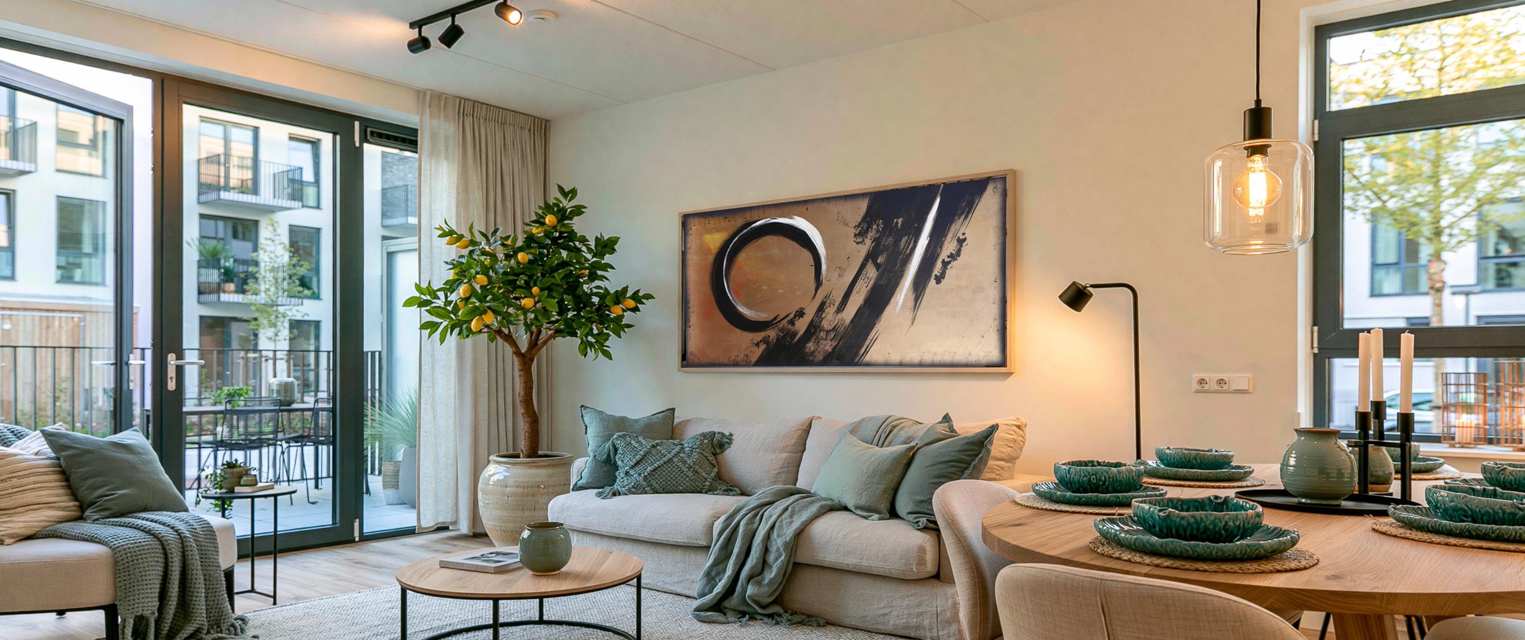
Consider the viewing distance
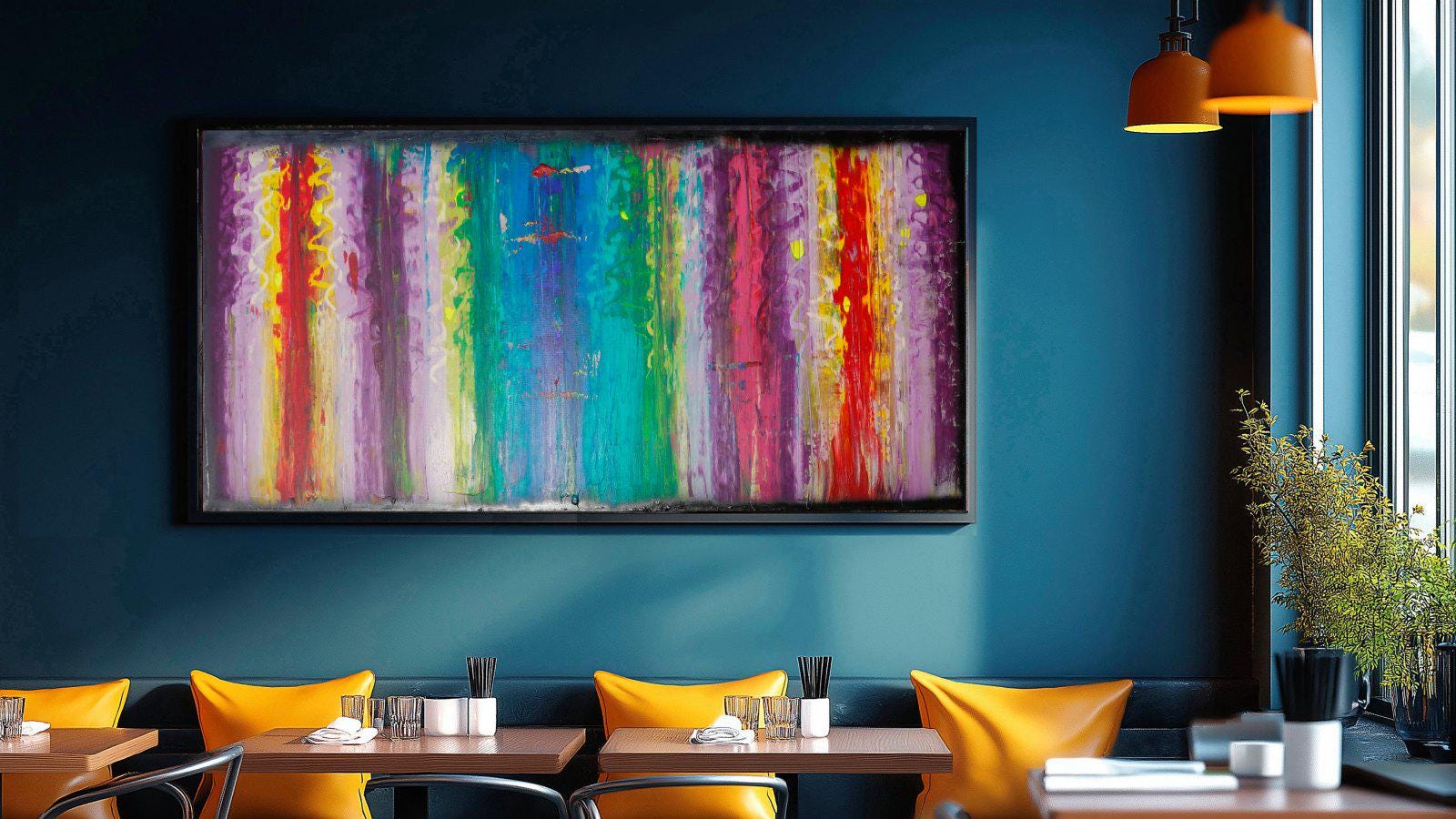
Very large paintings need an appropriate viewing distance. In a spacious living room or open-plan dining area, a broad canvas with expressive marks, layered acrylic and bold geometry can be admired both at a distance and close up. In a compact flat, a large work can still succeed, but a composition with open areas, a restrained palette or directional movement will generally feel less imposing than dense, high-contrast imagery. Texture also changes with distance. From across the room, impasto catches light and lends a sculptural quality to the wall. At close range, the same raised surfaces reveal the hand of the artist: palette-knife marks, layered pigment and subtle variations in sheen. This shifting experience is one of the distinct pleasures of an original painting.
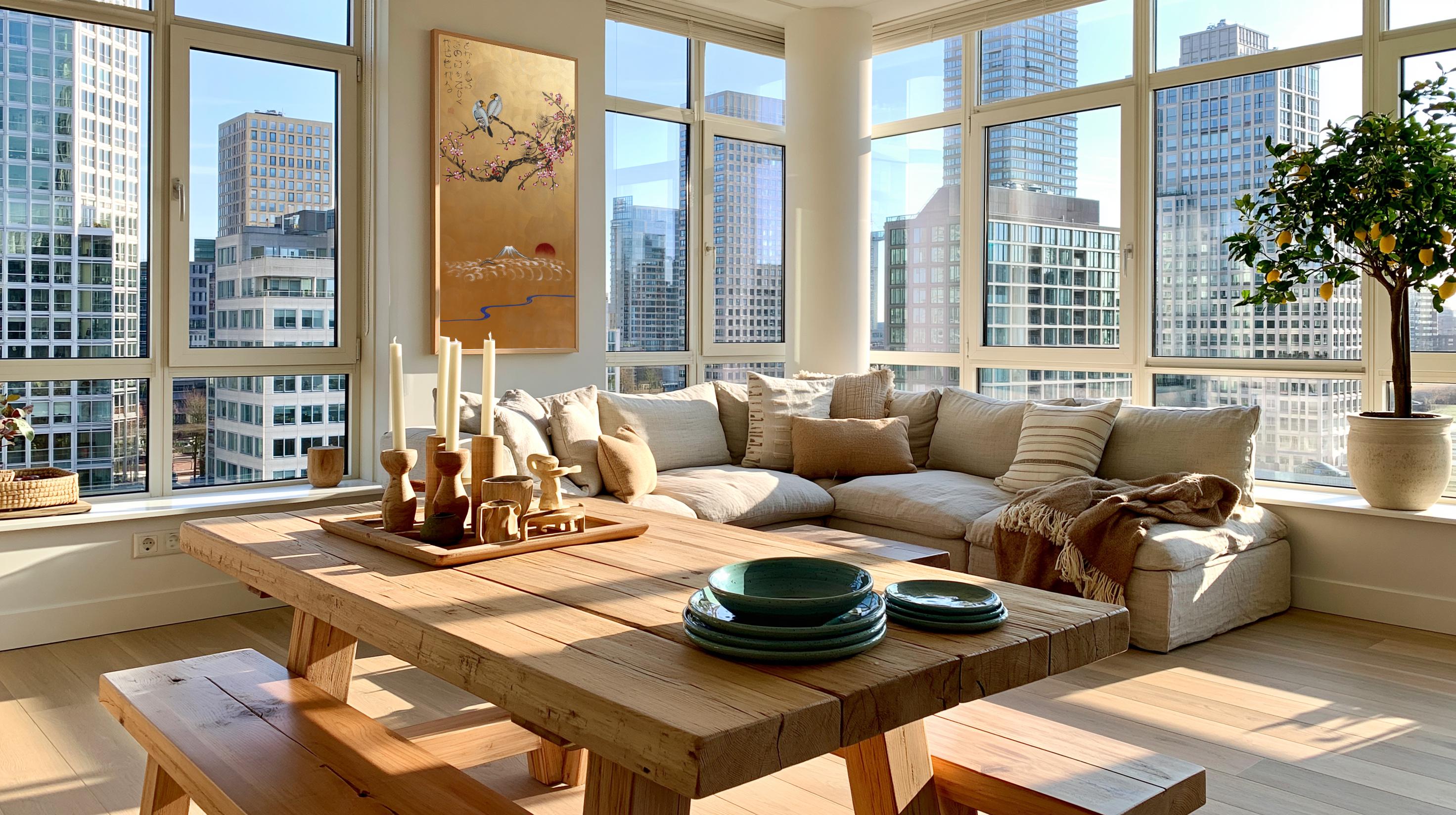
Choose a format that suits the architecture
A single horizontal painting is a natural choice above a long sofa, king-size bed or dining table. It can visually widen the room and reinforce a calm, linear layout.
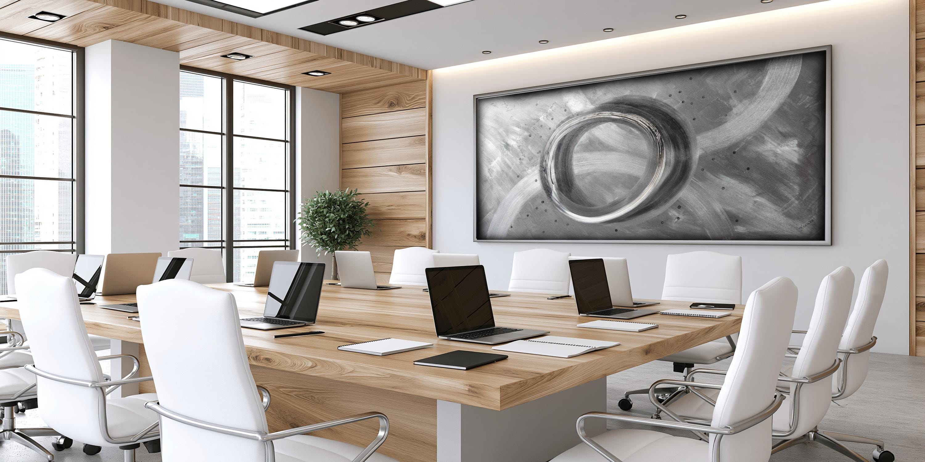
A vertical work brings the eye upward and suits narrow walls, entrance halls and spaces between windows. It is particularly effective where a room needs a sense of height rather than additional width.
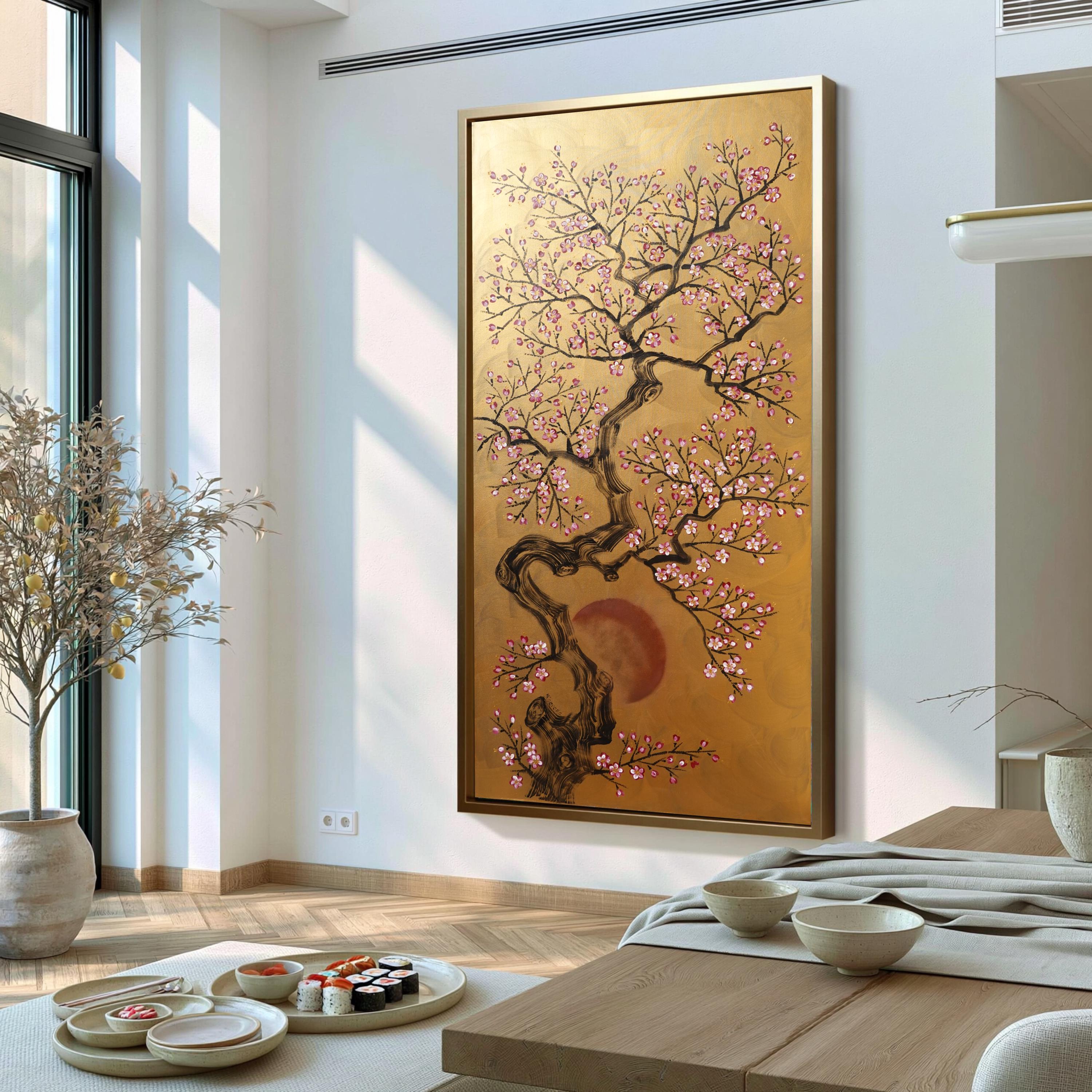
Diptychs and triptychs offer a different kind of rhythm. Their separate panels create pauses within a composition, which can echo architectural features such as tall windows, wall mouldings or the divisions of an open-plan space. They are not simply a way to fill more wall area. The intervals between panels are part of the artwork and should be measured consistently, usually with a gap of around 3 to 6 centimetres. For a wide expanse of wall, a multi-panel painting can feel more considered than several unrelated artworks. It brings scale while retaining visual movement.
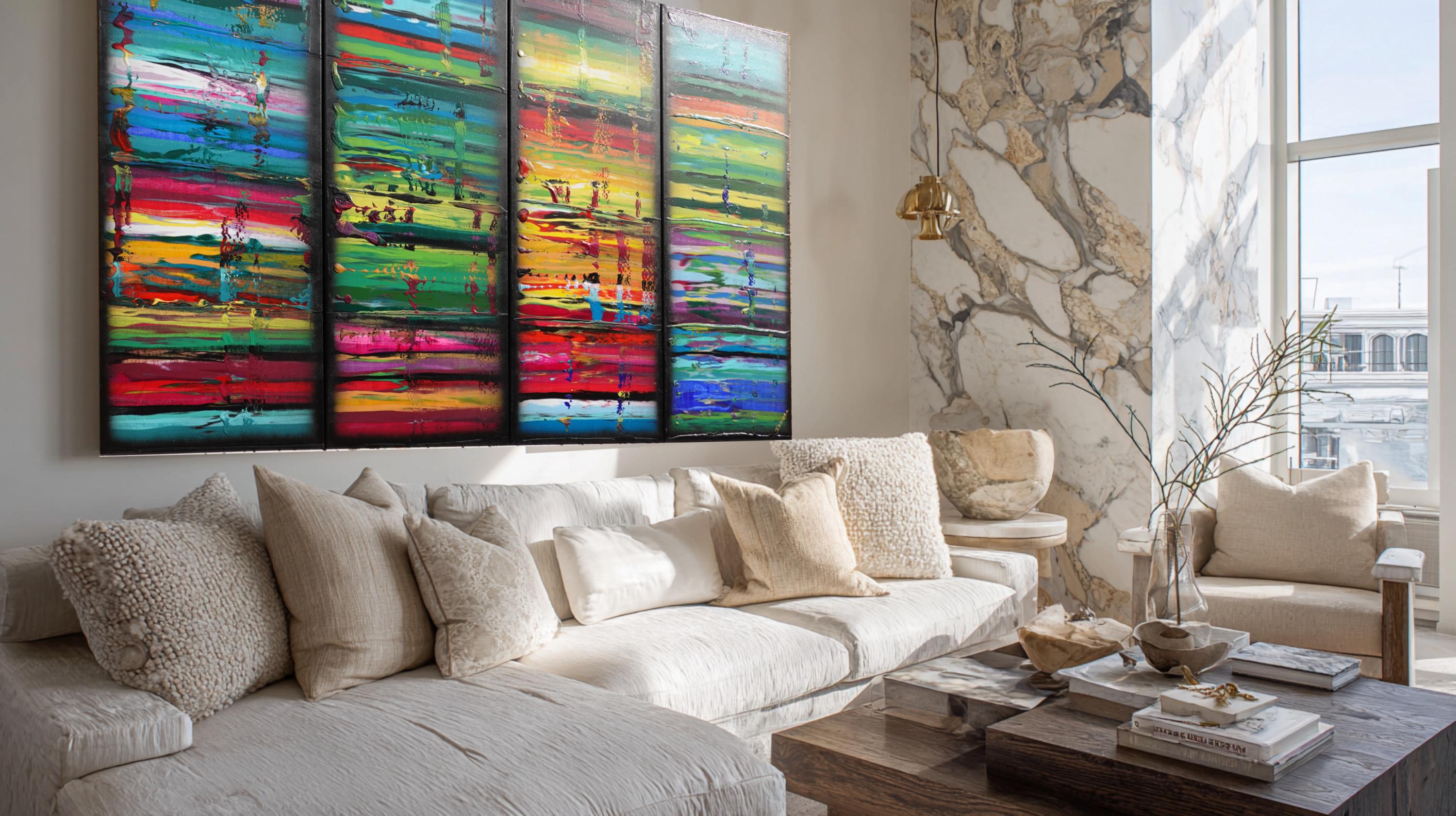
However, if the room already has strong symmetry or many grid-like elements, such as built-in shelving or panelled walls, one expansive canvas may offer a more restful counterpoint.
Build the palette around mood, not exact matching
Large art does not need to match every colour in the room. Exact matching often produces an interior that feels overly coordinated and quickly dated. Instead, choose a painting that shares one or two tonal relationships with the space, then introduces a note of contrast. In a neutral interior of stone, cream, warm grey or soft oak, abstract art with deep charcoal, mineral blue, sienna, pearl or muted green can add depth without disturbing the calm. Gold accents bring warmth when repeated subtly through brass lighting, a bronze table base or a small metallic detail elsewhere in the room.
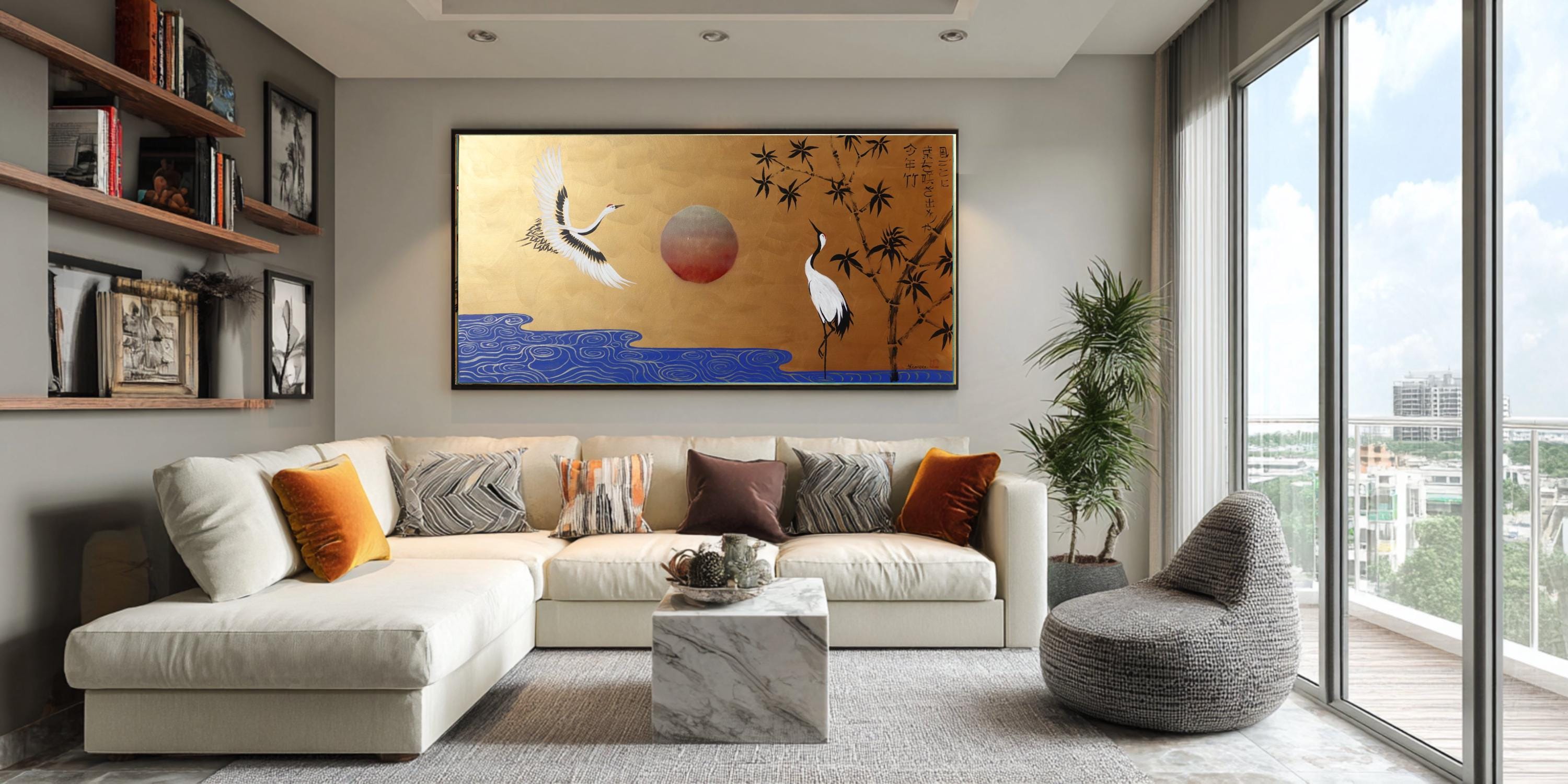
Their effect depends on light: a pearlescent or metallic surface may appear quiet in the morning and become luminous in the evening. For rooms with stronger colour, look for an artwork that edits rather than duplicates the existing palette. A painting can pick up the olive in a velvet chair or the rust in a rug while allowing neutral ground, black linework or soft white space to give the eye somewhere to rest. If a room is already visually busy, favour a more limited composition. If it is minimal, a bolder painting can carry the drama.
Original painting or fine art print?
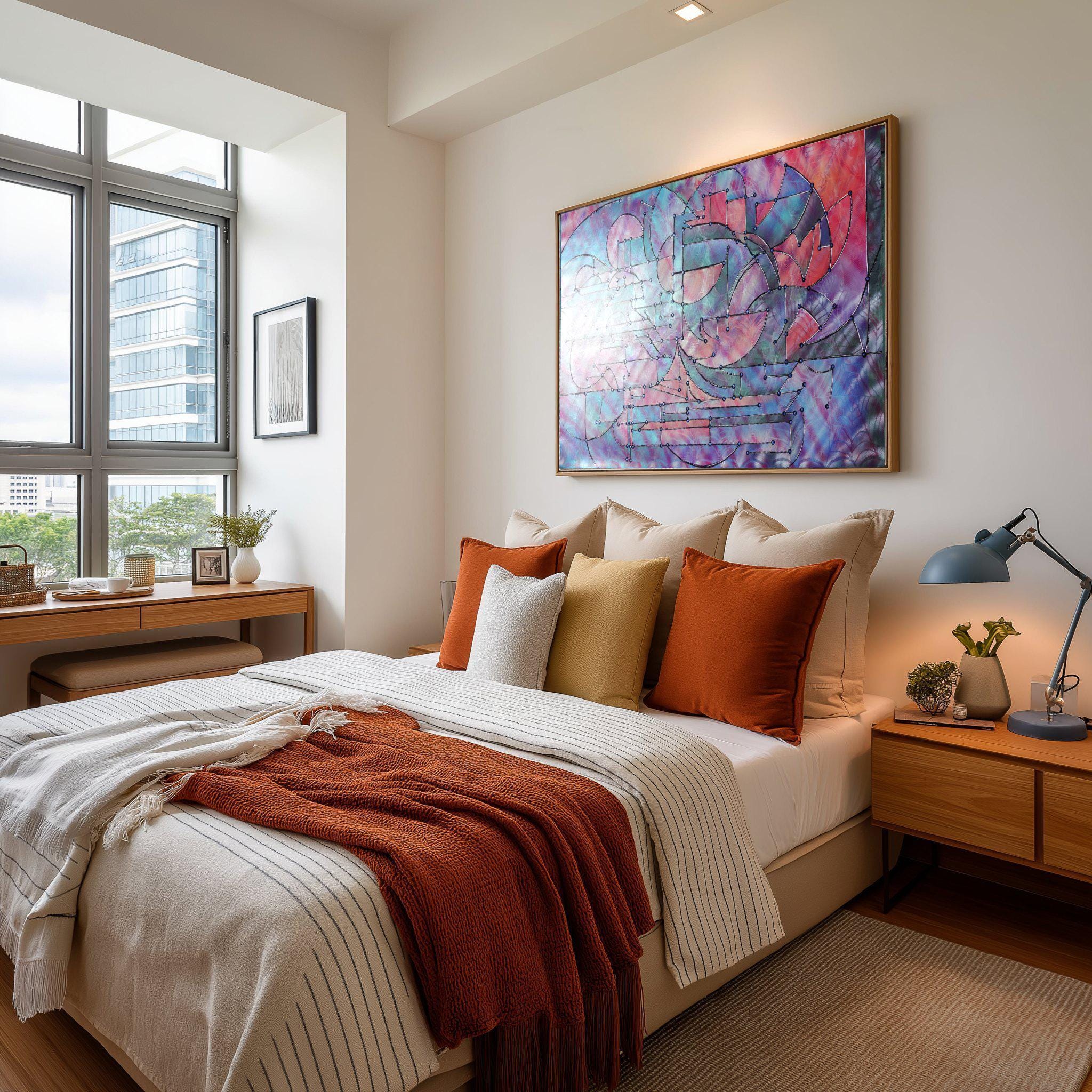
This is partly a question of budget, but it is also about what you want the artwork to contribute. An original hand-painted acrylic work has material presence. Its texture, edges, individual marks and variations in finish cannot be precisely repeated. It becomes a one-of-one focal point with a direct connection to the artist’s process. A fine art print offers access to a composition at a more flexible price point and can be the right choice for a secondary room, a changing scheme or a large project requiring several coordinated works. The quality of the paper, colour reproduction and framing make a considerable difference. A carefully produced print can feel refined, though it will not have the physical depth of impasto or metallic paint.
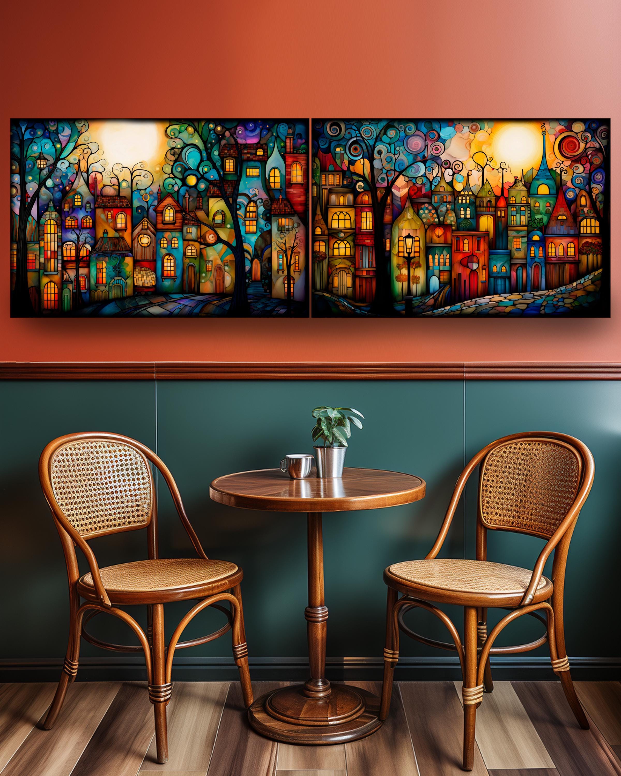
For a principal wall in a living room, entrance or dining space, an original often earns its place because the room benefits from that sense of authorship and permanence. For clients who have a specific palette, dimension or subject in mind, a commission may be the more precise route. Handmade in Germany, a commissioned work from KsaveraART can be developed around the scale and atmosphere of the intended interior rather than adapted after the fact.
Think about surface, finish and light
Photographs of paintings are useful, but they cannot fully show how a textured surface responds to daylight and lamps. Acrylic paintings with raised layers can cast tiny shadows. Gold leaf, gold paint and pearlescent elements reflect rather than simply display colour. This makes them especially effective in spaces with changing natural light, but it also means the artwork should be viewed away from harsh glare where possible. If the wall faces a large window, consider the angle of reflection during the brightest part of the day. A matte or softly textured work may be preferable directly opposite glass, while metallic detail can be striking on an adjacent wall where it receives light from the side. In dining rooms and hallways, warm evening lighting can draw out the richness of black, indigo, burgundy and gold in ways daylight does not. The frame, or lack of one, also changes the result. A gallery-wrapped canvas with painted edges feels contemporary and immediate. A slim black, oak or pale frame can sharpen the presentation and help the work relate to furniture finishes. There is no universal better choice: a frame adds definition, while an unframed canvas gives texture and scale greater freedom.
Place it with intention
Once the painting arrives, give installation the same care as selection. Use fixings rated for the work’s weight and wall type, particularly for substantial canvases or multi-panel works. Hang it level, but do not rely on a ceiling or skirting board that may itself be slightly uneven. Measure from the artwork’s centre and from the furniture below. Most importantly, allow the work to lead. Large art is not there to fill a prescribed rectangle. It should bring a room into focus, whether through the still elegance of Japanese symbolism, the energy of geometric abstraction or the tactile depth of layered paint. When the scale, palette and placement feel right, the wall stops being background and becomes part of the collection you live with every day.
Discover contemporary original paintings by Ksavera Explore unique large-scale acrylic artworks, Japanese-inspired paintings, and modern abstract art created by artist Ksavera in Germany. Visit the official art store: www.ksaveraart.com
Read more about modern art, interior design and contemporary trends This article is published on XXL Art, a platform dedicated to large-format artworks, creative inspiration, and contemporary wall decoration: www.xxlart.shop
Find your perfect wall art from thousands of designs Browse thousands of artistic motifs, fine art prints, and decorative artworks available in different formats for modern interiors: ksaveraart.pixels.com